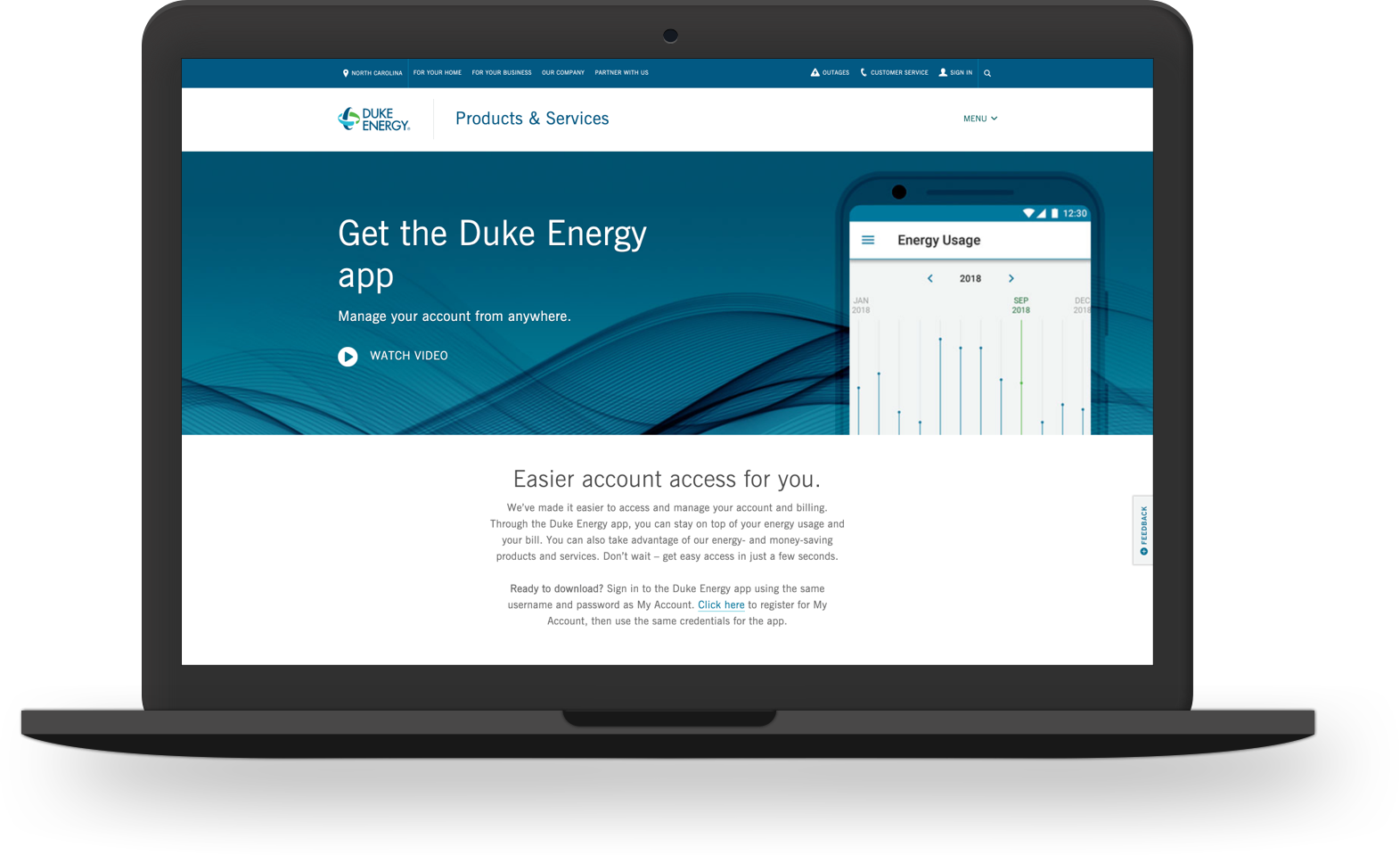
DUKE ENERGY
Manage your account from anywhere.
DUKE ENERGY
Creating an app experience that users value
Users can utilize the Duke Energy mobile app to stay on top of their energy usage and their bill. They can also take advantage of a variety of products and services.
Time to Innovate
As one of America’s largest energy holding companies, Duke Energy wanted to put more emphasis on “innovation” across the organization. Seeing that more and more users were interacting with Duke Energy via mobile devices, the plan was to release a mobile app that provided users with an easier way to engage with the company.
Powering Up
With 7.8 million electricity customers in six states, the app needed to appeal to a wide demographic. To account for this wide range of users, the team conducted multiple tests to better understand user expectations. As user expectations for an app increased, our stakeholders applied more pressure to see this project released into the wild which required a balancing act of user focus and business requests.
Responsibilities
User Research
Information Architecture
User Flows
Wireframing
Prototyping
Visual Design
Interaction Design
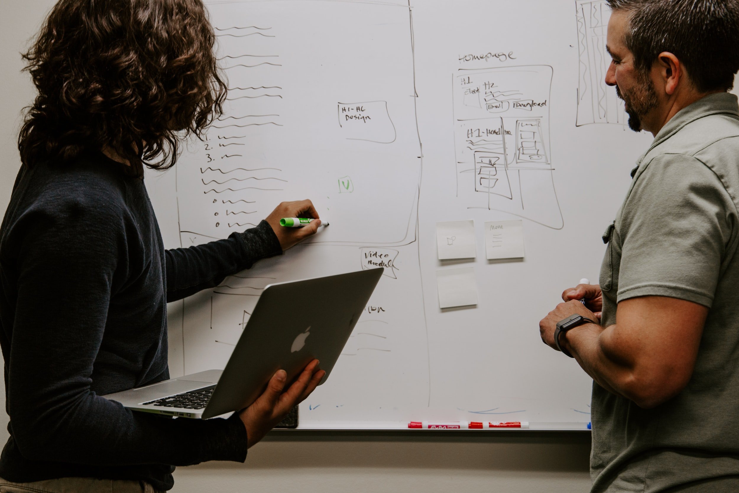
The mobile app’s starting point was to spark conversations with our users. The research team provided us with data about who are users were and what they expected to see in a mobile app. These insights were what framed the picture we would be painting once we began design and development.


Feature Preferences

App Download Propensity

Concept Exploration Samples from Initial Team Research
From the data, the team was able to determine the approach for our minimum viable product. With the “who” and “what” answered, we now needed to focus on the “how”. Using a native-first approach, we built mobile experiences based on the existing Duke Energy website’s architecture and flow.

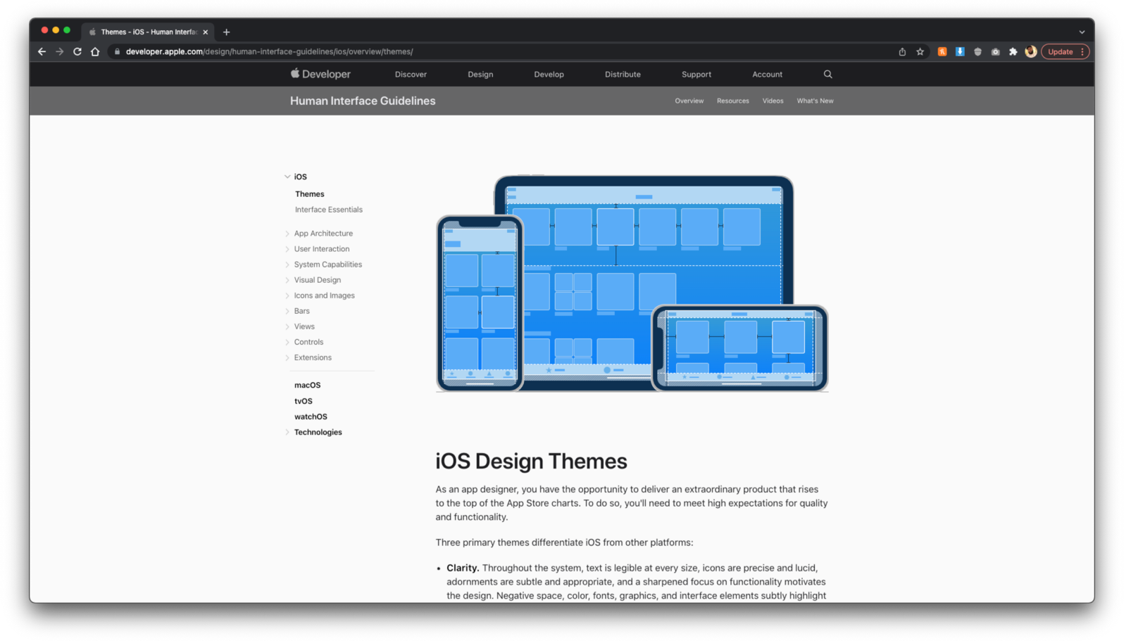
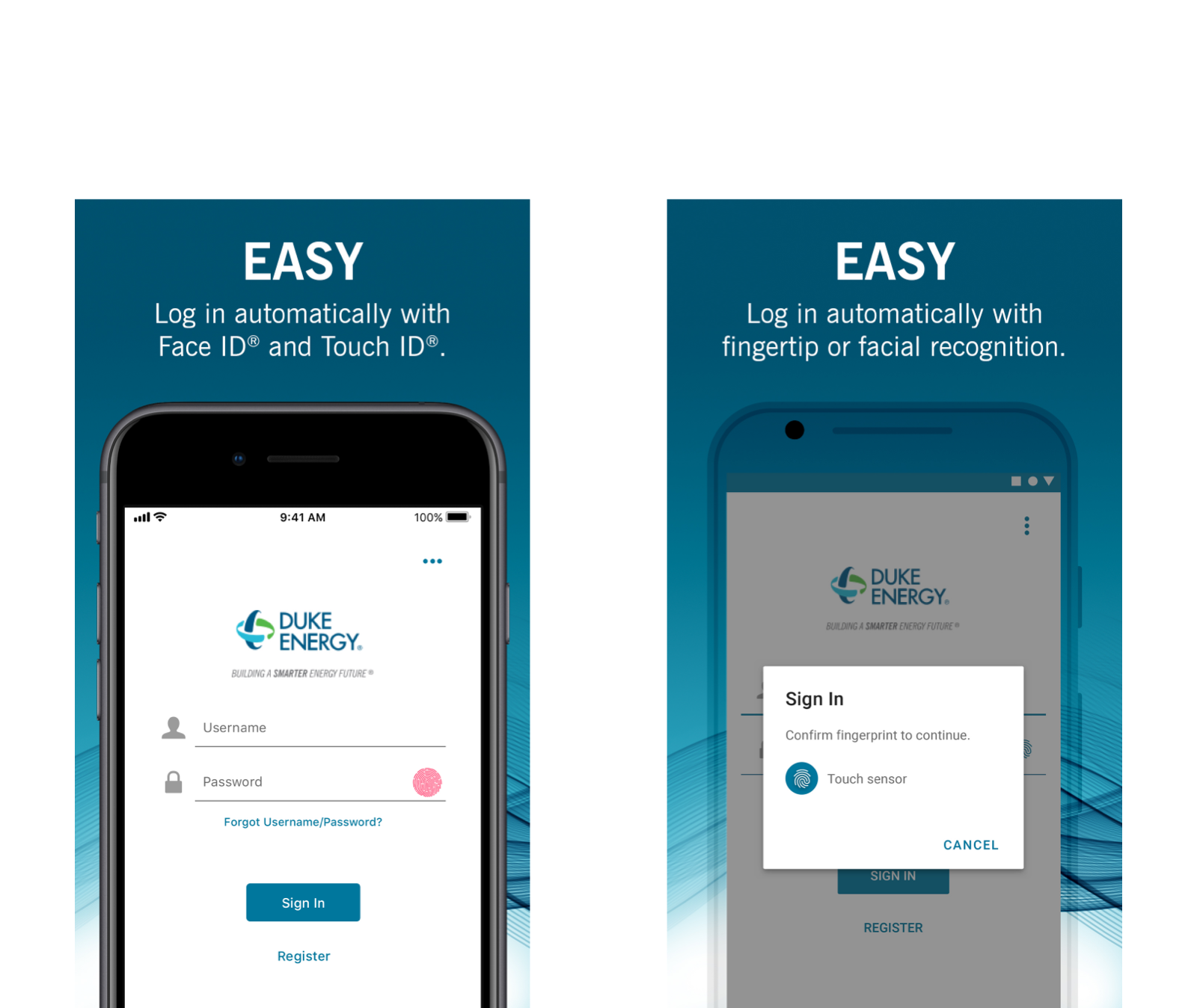
iOS Design

Material Design


Finding the Flow
Locating flows often required the team to resort to utilizing our own accounts as models for the mobile experience. With multiple scenarios and account types, this frequently left us with questions to be answered.


Assumption Validation
After documenting as much of the experience as we could, we could meet with stakeholders to validate a feature for accuracy. This approach kept the momentum moving forward and allowed external teams to be included in the story that we were planning to tell.
Cross-functional collaboration allowed the team to complete the main areas of focus in a little over a year. Throughout the process, we had to balance our ideal vision with technical feasibility to determine which areas were mobile “wrapped” experiences versus fully functioning, native-built experiences.

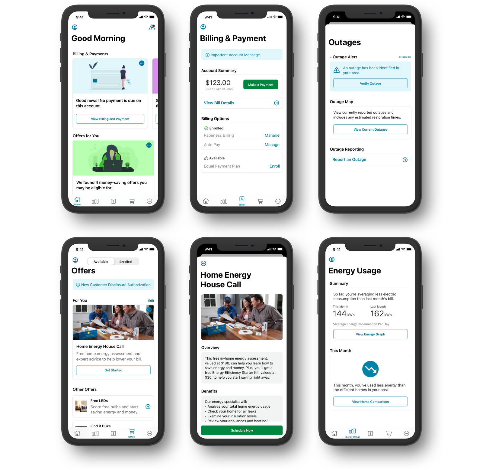
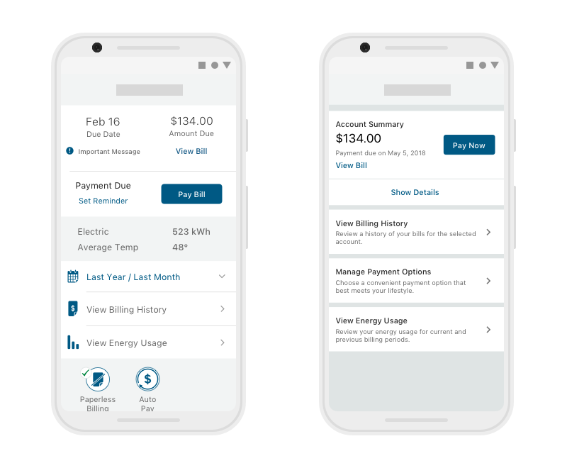
Billing Info / Payment History / Make a Payment

Outage Reporting / Outage Map

Drawing the Line
With such a complex application, the team had to compromise on which features to build. To determine the scope of a feature within a larger section, we would go back to the data to assess the value to users, traffic to the feature, technical complexity, etc.

Energy Usage with “Smart” Meter

Login / Pre-Login Options / Home Feed / Products and Services
Once the team built out the core functionality, we went back to our users for validation. We initially focused on the overall usability of our MVP build. As we continued working with users, we expanded our testing to include concepts for future versions of the mobile app as a way to keep pushing toward the future.

Billing and Payment Concepts

Main Navigation Concepts

Energy Usage Concepts

Products and Services Concepts
In March of 2019, the mobile app team released the result of our hard work to the public. Six months from that release date, about one million customers had downloaded the app - more than double the first year goal.


With the app’s release, we began exploring other features and integrations that could provide more value to both the business and the user. Many of these projects were works in progress that required discovery and communication to better align our implementation with the ongoing work of the stakeholder group.

Dark Mode
Implementing dark mode allowed us to give more control to the user and respect our users’ system-level settings.

Home Energy Report
An experience that allows our users to see a comparison of similar homes and how they use energy. It also includes an estimated breakdown of your energy usage by different categories.
*During many of the integrations, we would design for both current state and future state. This allowed us to continue pushing releases without losing sight of the future innovations we had planned.

Duke Energy Connections (Future)
A program targeting customers who have just moved and offers bundled utility programs at a discount.

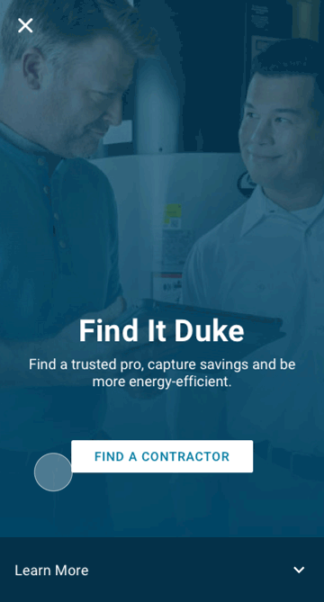
Find It Duke (Future)
A program that provides our users with free referrals to contractors who are insured, background checked and performance reviewed.

Real-Time Energy Usage/Smart Meter (Future)
The Smart Meter program is an integration that allowed people to use a gateway device to enhance their current meter with the ability to review their home’s energy usage in real time.
The Duke Energy app was built using mostly default components from the iOS and Android platforms. This allowed us to achieve a consistent appearance across each system and made sure that the app was adaptable and familiar. As we continued pushing boundaries, we explored different ways of expressing more of the Duke Energy brand as well as various motion and animation principles.